4 Tips for a Strong Fintech Landing Page
Creative | MarketingAny fintech landing page should act as a vehicle for gearing users toward signing up for the platform. Here are some fundamentals for fintech web design, specifically how to build a homepage that is visually appealing, a breeze to navigate and able to provide the user with everything they might possibly need to know, all in one place.
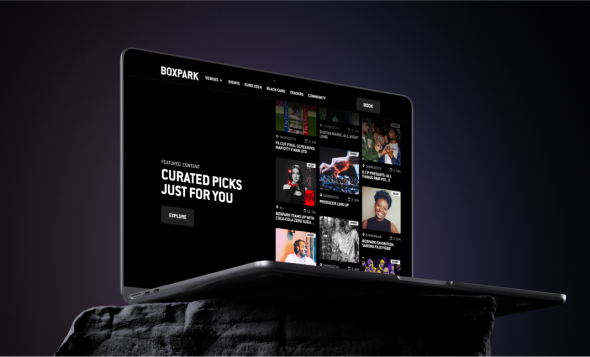
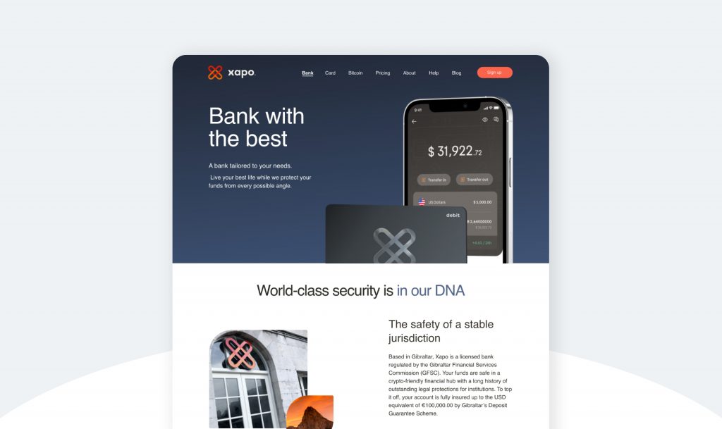
Design a high-converting ‘hero’ section
This part of the homepage is what visitors will see first when landing on the website. The hero needs to be image-led and introduce the platform. It should have some room for concise body copy, alongside clear CTAs (i.e. ‘Get started’) from the off-set.
Try to summarise and embody the product, and include any in-app shots that give a glimpse of the platform across different devices.
This will immediately help potential customers to decide if it aligns with their wants and needs, with the goal of driving conversions. Use a simple layout and sparse copy to allow for tech-heavy visuals to take centre stage and minimise noise.
At the same time, the user also needs to be able to gather the information they need with ease. Think clear navigation with self-explanatory sections such as pricing, products, and resources.
Build trust with a client portfolio
To emphasise your brand’s credibility and suitability for a potential client, include a block of client logos close to the top of your homepage (you can go into more detail in a designated case studies section).
Stamping some well-known brands (particularly if you cater to businesses) will reinforce your credibility and relevance to similar potential clients.
Deep-dive into features
This is your chance to flaunt the key features of your product. You should include a ‘why choose us’ section (or something similar). If you have a mission statement or story, it will go nicely here. Break down what your platform offers and who it’s designed for, as well as any USPs.
Try to use brief sentences or bullet points. You might also want to dig deeper into your brand values and look more closely at the different dashboards within the app and website.
Don’t forget to keep pushing for those conversions. CTAs should tell the user exactly what is going to happen when they click them.

Close the loop with testimonials and pricing
When your user has come to the end of their journey and reached the end of the buyer funnel, close the loop by providing additional information about things like pricing and membership plans.
For added transparency, add in a review or testimonial block (or both). From here, it should be kept very simple, with no distractions to take the user away from completing the conversion.
Limit your footer to any links to socials and a lead-gen form if you’re using one.
Want to chat about designing a fintech landing page? Speak to one of our experts now.